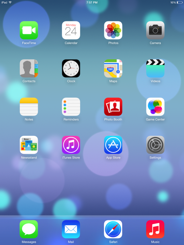
Apple recently opened the gates for iOS7, the new software iteration for its portable devices. For what's changed see this
- The first thing you notice after the install is the new look of the OS
- Everthing is a flattish, 2Dish look to it, which by the way is a breeze of change for an OS who hasn't seen much change since its inception
- The homescreens have a nice animation to it
- The photos that you click can now be edited like an Instagram fashion
- Some new tweeks can be clearly seen like the live clock, and the new look of the App Store
- The sliders in the settings app have also changed
- The wallpapers are very cool, also including some live wallpapers which the call "Dynamic"
- The keyboard is also got a new white matte color
- Probably the most user friendly new thing in the iOS 7 is the new control center which brings all the setting one would want to see from a swipe up from the bottom of the screen
- The new multitasking view is also great you can see whats going on, in your apps, just swipe up and they are gone
FINAL VERDICT
Well, in my view the new interface design is quite welcome, but looks a little cartoony, but its a fresh take on the other wise stale look of the iOS.The look first looks WOW, then after a few hours GAUDY, then after a few weeks of usage you might think. HMM, how was it like before???. So, ya its a nice try by Apple
RATING-
4/5
I subtracted 2 points for
- For not providing SIRI, Air Drop, Safari's 3d Tab interface on the iPad 2
- In my opinion Apple should have included the editing features of photos like the filters in the camera app and not to edit after the photo has been clicked


No comments :
Post a Comment